
Evolving a digital patient support program from 0→1→2
Project
Role
UI/UX Design
UX Research
Product Strategy
Team
3 designers (me as lead)
2 PMs
4 engineering teams
Year
2025-2026

Overview
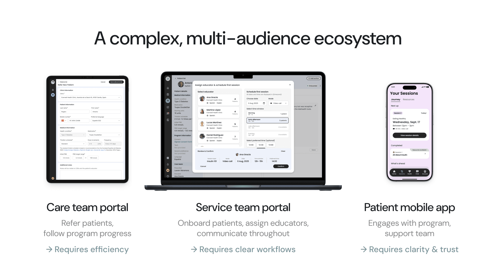
I joined BrightInsight as lead product designer on a digital patient support program for our global pharma client helping people starting injectable insulin. The program spans three surfaces (patient mobile app, service team portal, and care team portal), all connected through a shared platform.
I led the work through three distinct phases: building a research-backed foundation, shipping the full 1.0 experience across all surfaces for the Spain market, and now leading a complete product transformation for 2.0 in Germany that shifts from a human-led service model to a digitally orchestrated one.
This is the story of navigating ambiguity, making trade-offs under real constraints, and designing for an ecosystem where every decision has downstream stakes.
Project & Process
Building the foundation with research
We inherited visual concepts from a branding agency. Polished screens, but no information architecture, user flows, or hierarchy behind them. Before layering on features, I needed to get the structure right.
I led quick-turn UXR studies: an open card sort to validate navigation groupings, label testing to match user mental models, and a preference test on visual direction with people living with diabetes. Key findings reshaped the app. We renamed "Journey" to "Sessions," elevated Chat to primary navigation, and removed a Library section that confused participants. Solid-color backgrounds won over gradients because they served as wayfinding cues between sections.
Two weeks from kickoff to validated IA. Enough signal to move forward with confidence.

Shipping the 0→1 experience
From there, it was nine months to ship the full 1.0 across all four product surfaces. Six core feature areas in the patient app alone: enrollment, home dashboard, session journey, health tracking, 1:1 educator chat, and account management.
Nothing happened sequentially. I was shaping product strategy, designing screens, aligning stakeholders, and working through engineering proofs of concept, all in parallel.
The session journey was the most complex piece. It touched every stakeholder and all four engineering teams. I designed the full flow from welcome call to video session to post-session resources, making deliberate choices about what details to surface at each level, how to communicate progress, and how to handle milestone states for an anxious patient population.
Trade-offs and what they taught me
One decision stands out. I designed the session experience around a waiting room pattern: a set appointment time, join early, wait for your educator. Familiar and intuitive.
Internal business teams pushed back and overrode me with a 3-hour window model instead. I disagreed, cited patient research, but was outweighed. So I redesigned: new notification logic, new session states, a "preferred time" field as a compromise.
After launch, service team members were using that preferred time as a de facto schedule, but patients couldn't see it and were missing sessions. We shipped a fast-follow fix. The thing I'd advocated for originally turned out to be what both sides needed.
The lesson wasn't "I was right." It was about adapting quickly when overruled, then using real-world signal to course-correct and having the relationship capital to push for the fix.
Leading the 2.0 transformation
In late 2025, I was asked by our CTO to lead the next version from both a product management and UX perspective. This isn't iteration. It's a fundamental model shift.
1.0 replicated the market-familiar in-person experience digitally: human sessions drive the program, educators decide when you progress. 2.0 flips that. The digital journey drives progression through content, rules, and intelligent signals. Humans support and reinforce rather than manage every step.
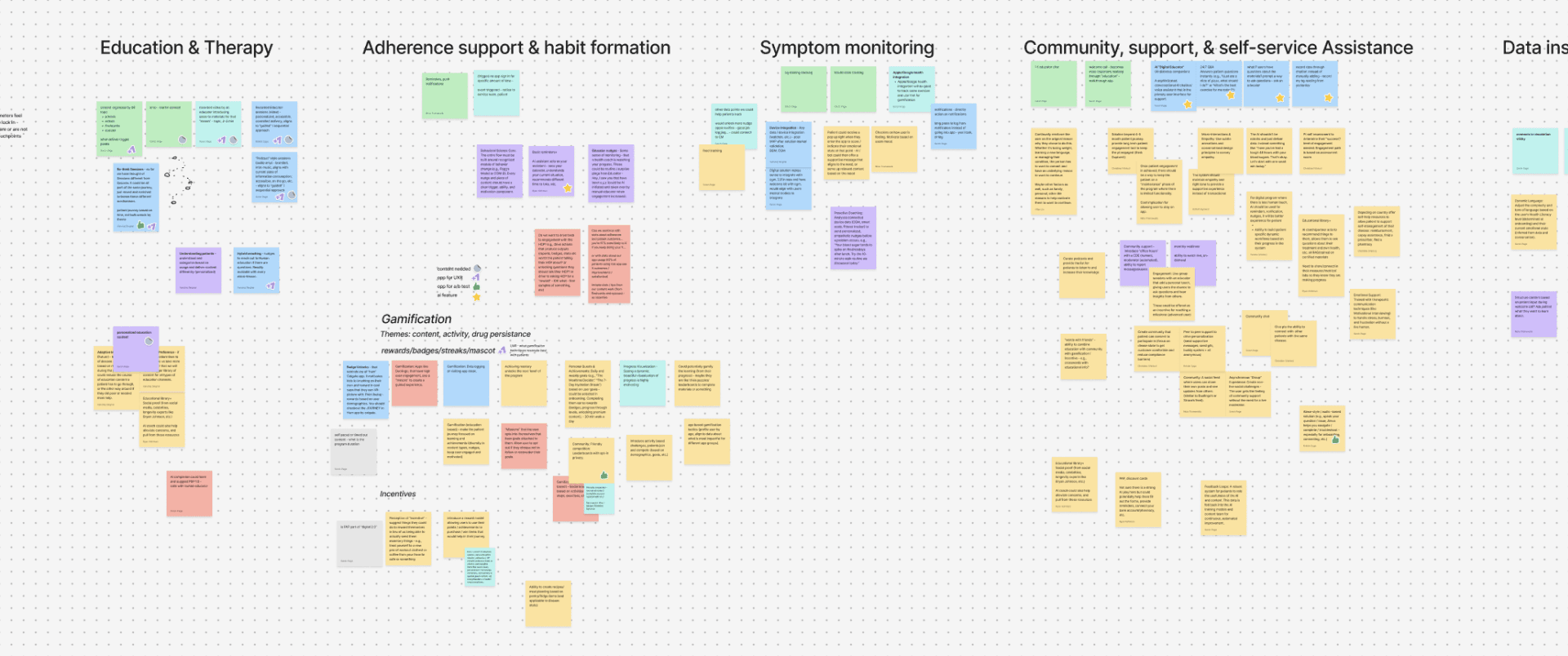
I started with qualitative research from service team members, then led cross-functional brainstorm sessions to formalize objectives and barriers. We're rethinking the program journey, onboarding, engagement nudges, and re-engagement triggers, all designed for daily behavior change rather than just session attendance.
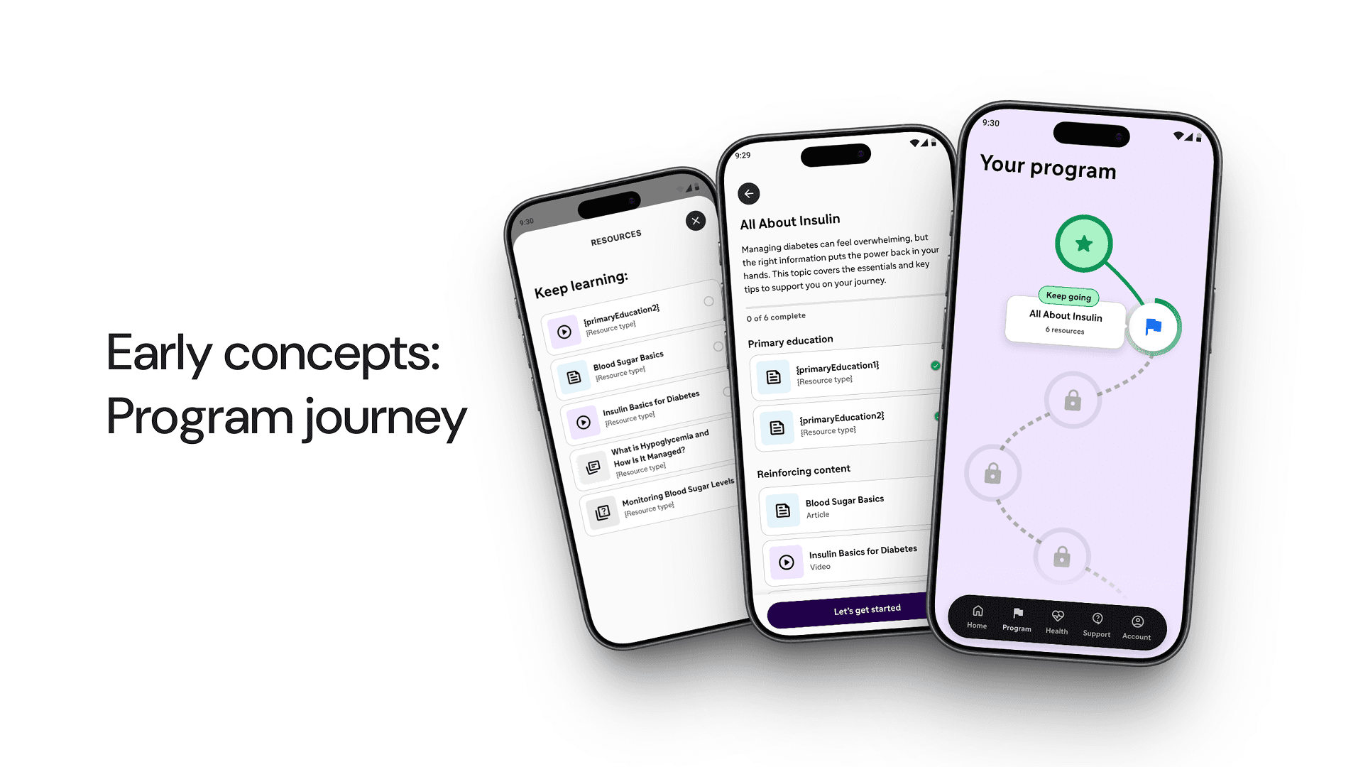
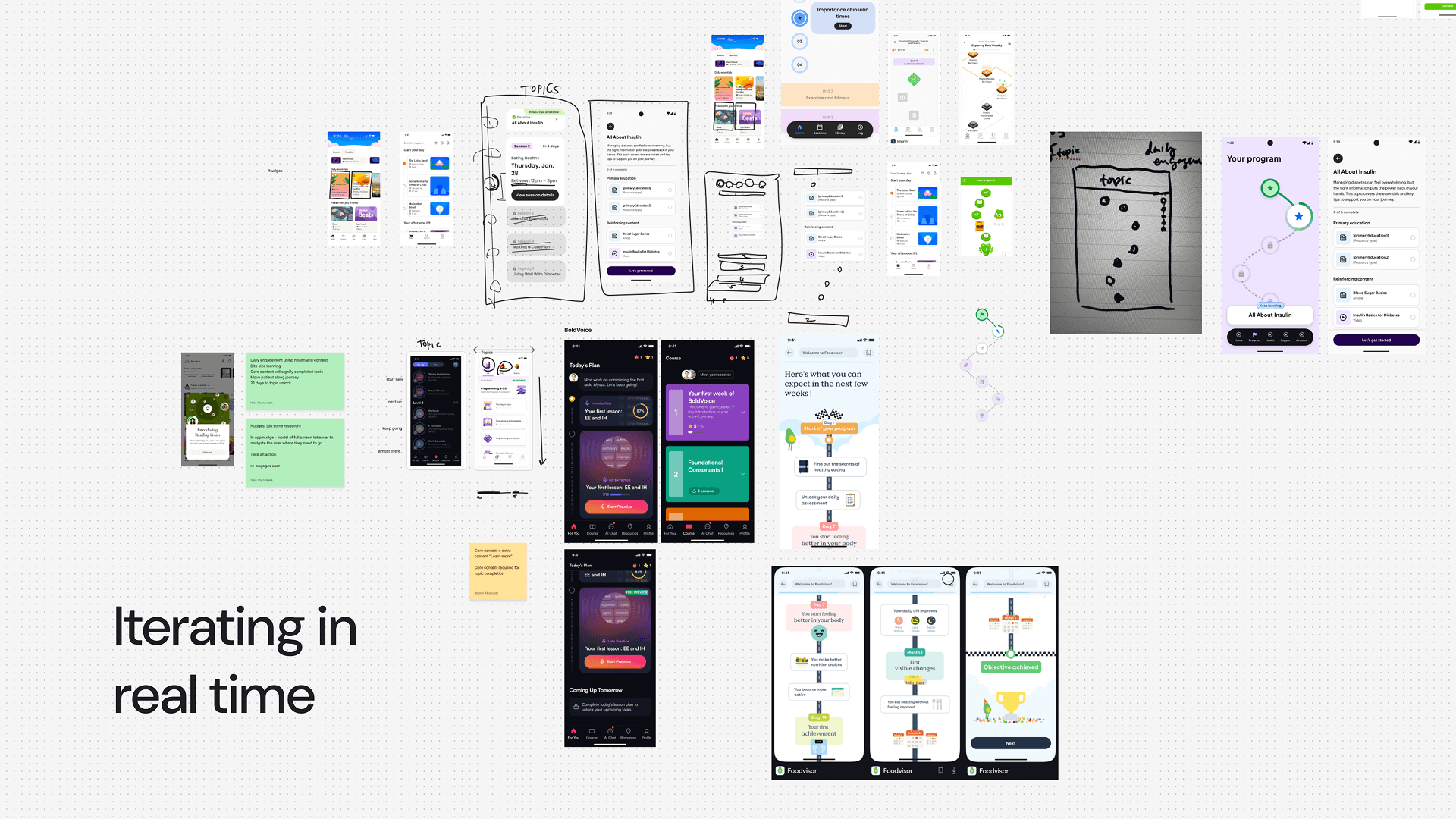
Early concepts are in front of the customer now. Feedback is shaping rapid iteration.
Version 2.0 launches in Q2 2026 and will unlock market expansion into countries without existing diabetes support programs.
Outcomes & Learnings
Shipped a full multi-surface patient support program from concept to market in 9 months. Now leading its transformation into a scalable, digitally orchestrated model.
What this work reinforced for me:
Every decision has real stakes. In healthcare, a confusing flow doesn't just frustrate someone. It might mean they don't understand how to take their medication. You have to be rigorous and fast.
Constraints are creative fuel. Regulatory review, shifting business requirements, technical limitations. I've learned to design with them, making compliance feel invisible rather than burdensome.
Ship fast, but ship right. Speed matters, but you can't skip the rigor. I've gotten good at finding that balance.
Trust is everything. Healthcare is personal. You're not building tools, you're building trust. The experience has to feel human, not transactional.
"[Sarah] is the glue between patient and HCP solutions, between product and design, between innovation and implementation. She's a master at her craft, but more important IMO is the way she leads by example."
— Kristin Z., VP of Marketing & Insights, BrightInsight
