
Rethinking vacation rental apps
Project
Backpack
Role
User Research
UX Design
UI Design
Year
2024
Overview
Backpack is a passion project born from the traveler in me and the frequent frustration of using rental platforms that feel built for everyone except the guest.
I wanted to rethink the experience from a guest’s point of view: clear pricing, fewer surprises, and a streamlined path from browse → book. I led this from research through mobile UI design, always asking:
What helps someone make decisions with confidence?


Project & Process
Seeing the experience through guests’ eyes
I started by asking a simple question:
Who are vacation rental booking apps really built for?
Using competitive benchmarking and usability tests, I dug into the experiences people actually have with platforms like Airbnb and Vrbo—not just what features they offer. What I found shaped the direction of the whole design: guests wanted clarity, speed, and control.
Dig into the research:
Designing for Transparency
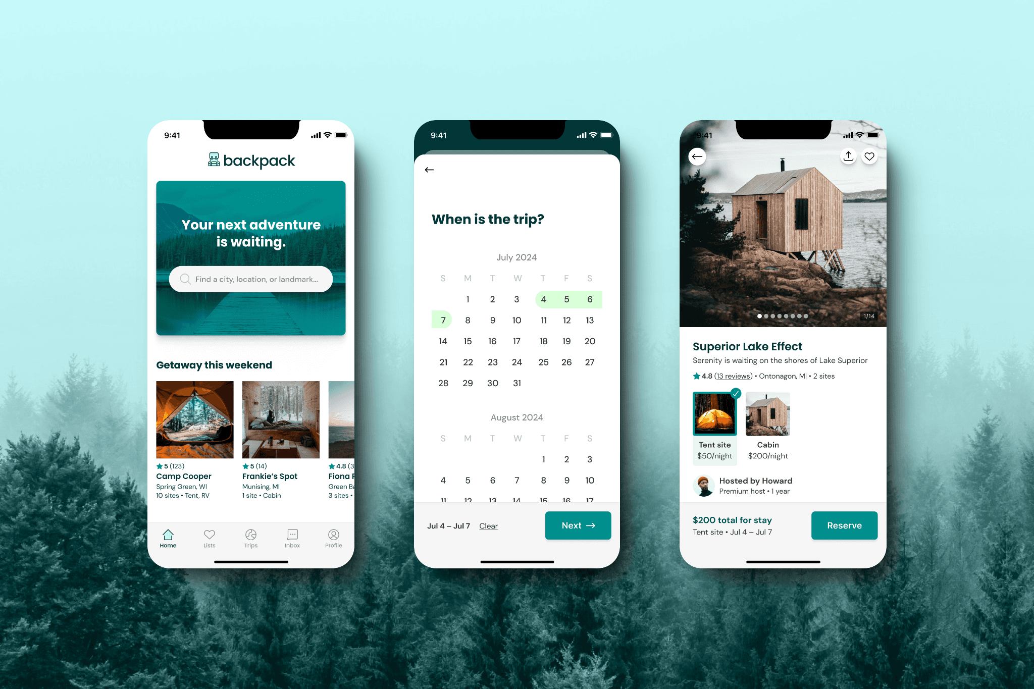
From the first sketches to mobile UI screens, every decision was about reducing uncertainty:
Show total trip cost early (no hidden fees)
Streamline search so guests get results fast and understand their options
Simplify booking flows to minimize steps and cognitive load
I leaned into minimalist patterns—prioritizing only what truly helps a guest make choices—and dropped anything that didn’t serve that purpose.
Dig into the design:


Outcomes & Learnings
Too often, big booking platforms optimize for hosts or market share instead of the guest’s peace of mind. Backpack flips that script. By anchoring every design choice in real user pain points and clear business outcomes (like reducing bounce at the pricing screen), the experience feels honest and empowering.
This project sharpened how I think about product design: start with real people, use data to steer choices, and keep the interface quiet so the experience speaks for itself.
