
Strategizing scope and design for a B2B SaaS app
Project
LaunchCTRL
Role
UX Design
UI Design
PM
Team
1 founder
4 engineers
1 designer (me)
Year
2023 – 2024

Overview
LaunchCTRL started with a familiar problem: early-stage teams drowning in tools that didn’t talk to each other. CRMs over here. Tasks over there. Too many subscriptions, too much friction.
I joined as the sole product designer and acting product manager to help take the product from idea to MVP. The goal was to create one calm, integrated workspace that let small teams focus on their work instead of managing their stack.
Project & Process
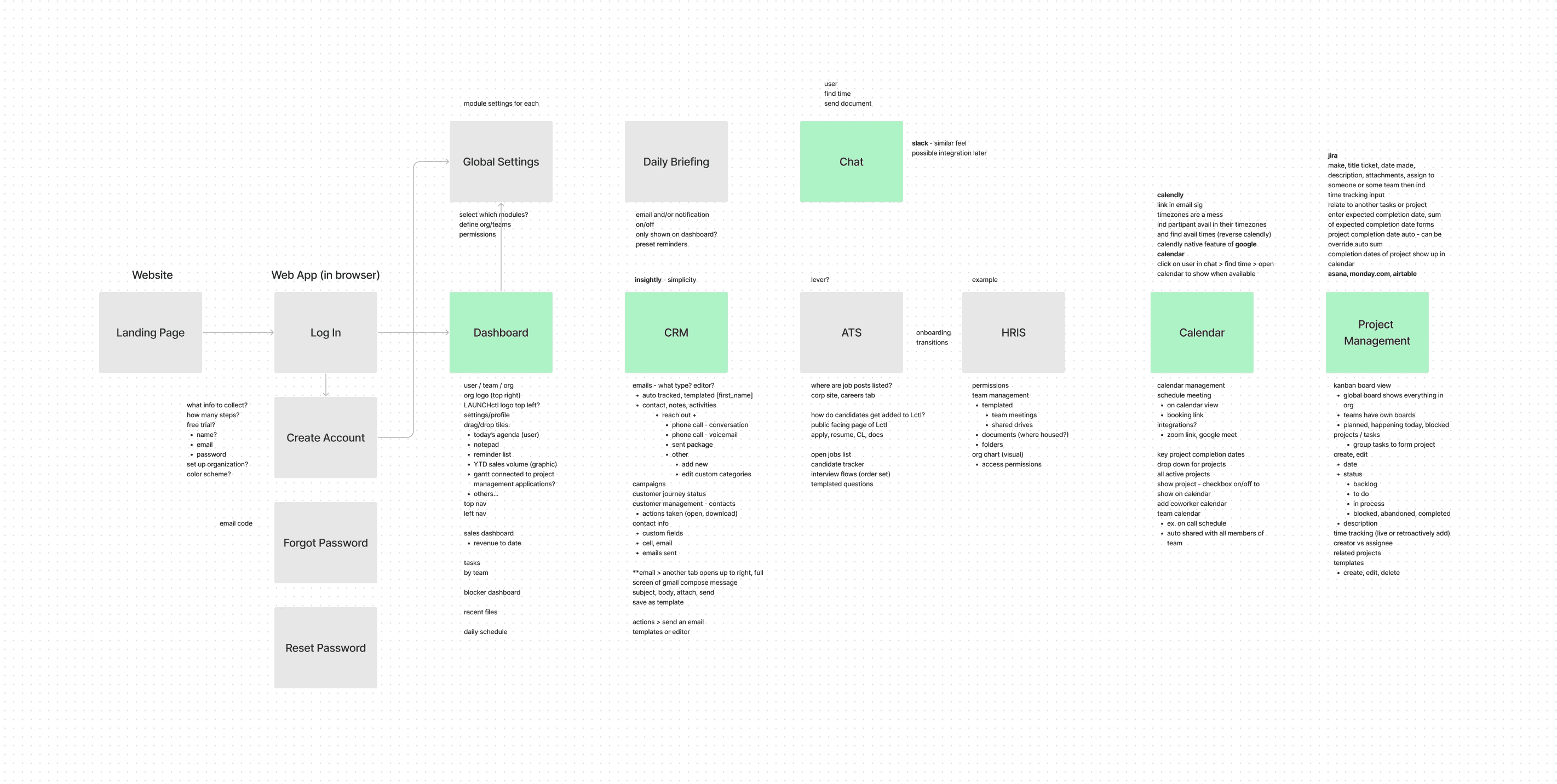
Starting with the why
Most startups don’t need more features. They need fewer decisions.
Before designing screens, I worked closely with the team to define what actually mattered in an MVP. We focused on the workflows teams touched every day and cut anything that didn’t support them.
The business goal was clear: differentiation through simplicity, not volume.
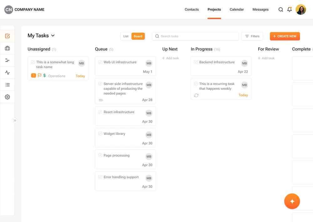
Designing for flow
The challenge wasn’t adding tools. It was helping them work together.
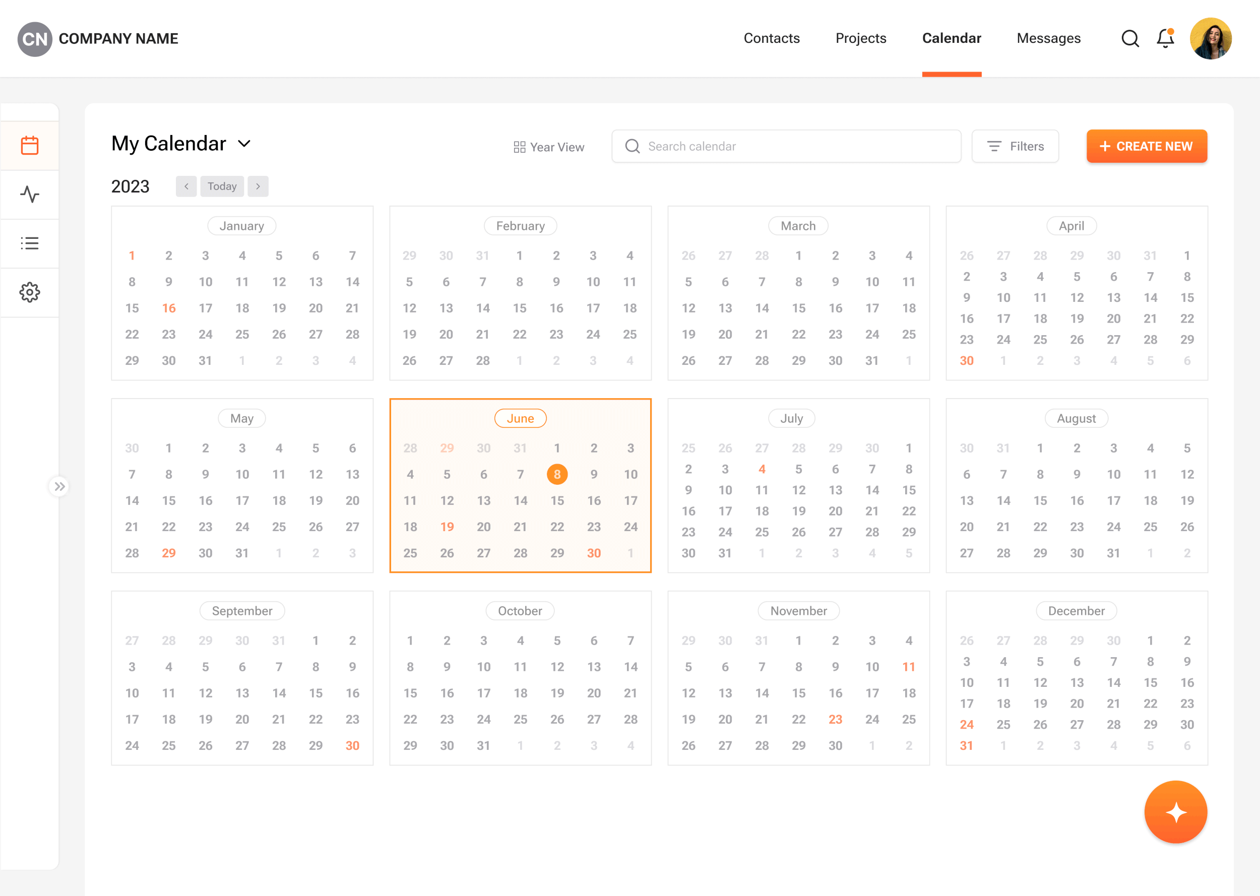
I designed the product around connected workflows rather than standalone features. Shared patterns, familiar interactions, and a consistent visual language helped reduce friction and make the platform feel learnable from day one. Early flows and wireframes were mapped in FigJam to test assumptions quickly and keep the team aligned.
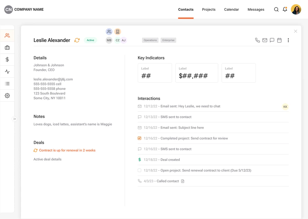
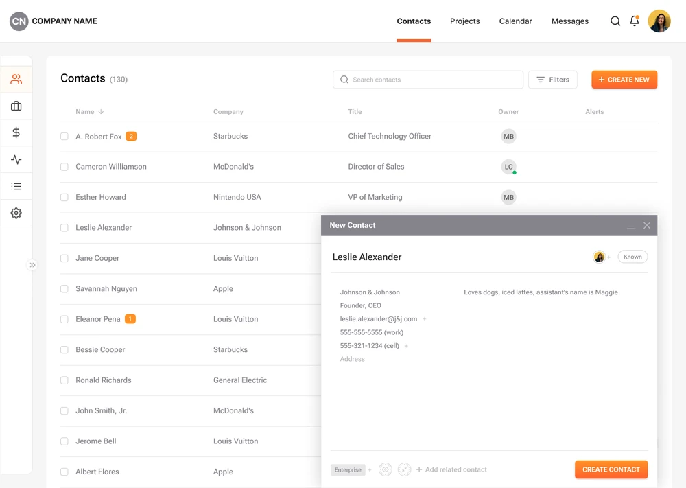
Keeping the interface out of the way
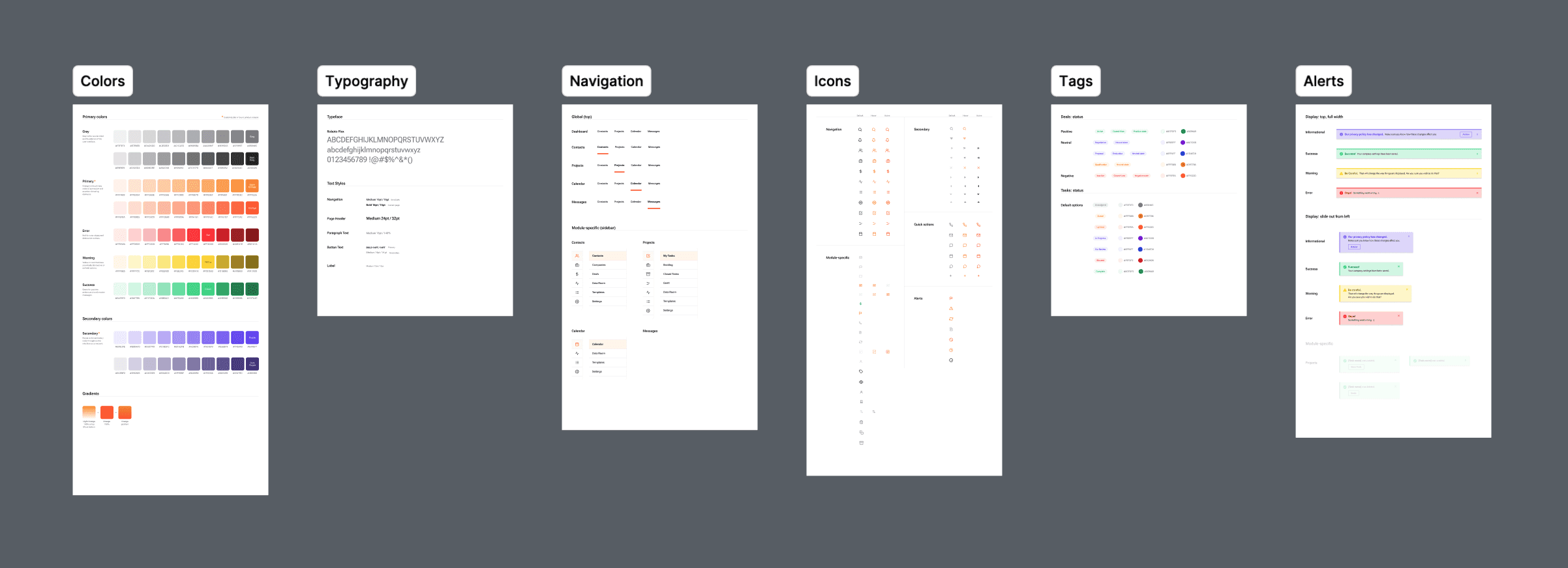
Visually, the product needed to feel quiet and dependable. I leaned into restraint: clear hierarchy, minimal styling, and predictable interactions. Every decision was made to support speed, clarity, and repeat use, not visual noise.
A lightweight design system ensured the product could grow without losing cohesion as new features were introduced.

Outcomes & Learnings
LaunchCTRL ultimately shut down due to market and resource constraints, but the work shaped how I approach early-stage products. It reinforced the value of clear priorities, thoughtful constraints, and designing systems that support both users and the business.
Those lessons still guide how I build products today.
“... As a designer, Sarah has a remarkable ability to produce highly specific and on-target designs from vague and sometimes incomplete requirements and is able to design highly compelling, refined, and engaging user interfaces. ...She is incredibly smart, has a keen eye for marrying design and use cases, and is exceedingly comfortable discussing and analyzing the intersection of product and business both at a high level and at specific detail. Her ability to develop, present, and defend a highly informed product functionality argument is top notch. Sarah consistently has outsized impact - her diverse skillset matched with her great efficiency easily accounts for several team members. ”
— Matt Blais, Founder & CEO, LAUNCHctrl